MotionCache
Art direction, Logo Design, Brand Design
Motioncache is a startup focused on motion design education and digital assets. The goal was to create a flexible, playful brand identity that works across web, products, and motion-based applications.
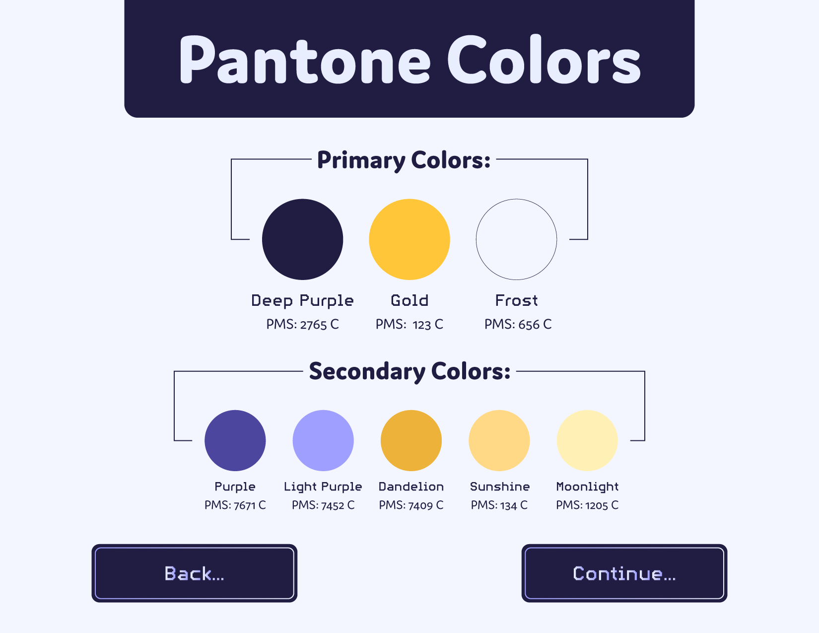
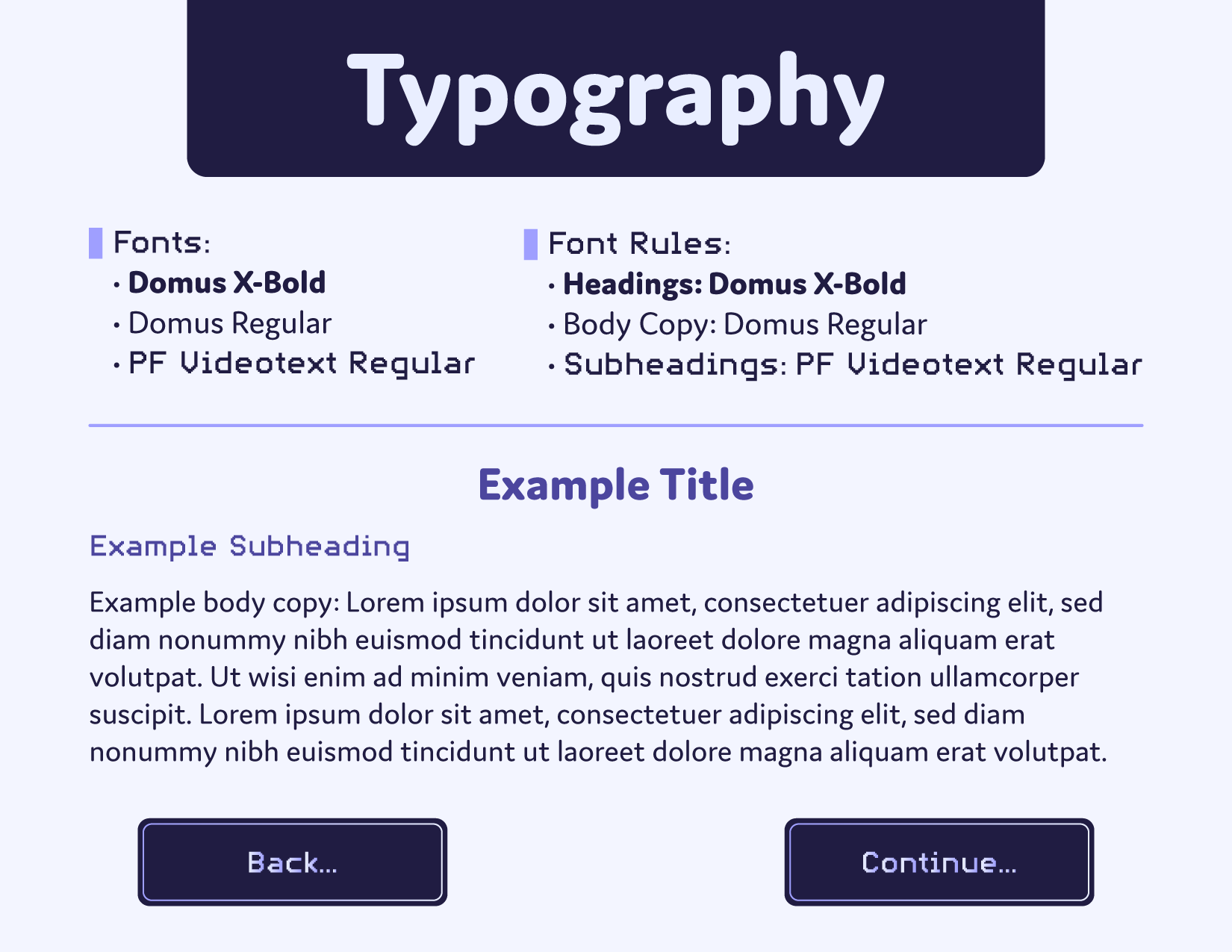
I led the logo and brand guide from concept to delivery, defining a visual system that’s functional, expressive, and rooted in the brand’s core: gaming and animation.
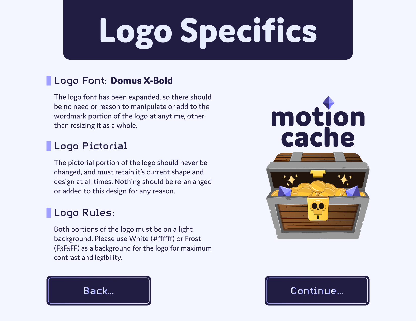
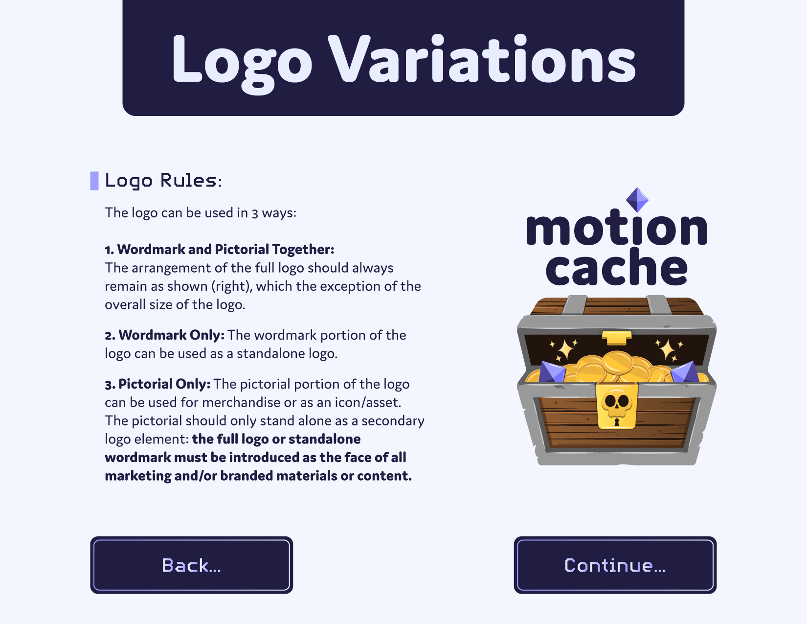
The logo features a treasure chest to symbolize a “cache” of content. It’s playful, discoverable, and tied to Motioncache’s audience of motion designers and gamers. Inspiration came from retro gaming brands like GameCube and titles like The Legend of Zelda, blending nostalgia with a modern feel. The combination mark allows the wordmark and pictorial icon to work independently or together, giving the brand flexibility across touchpoints.
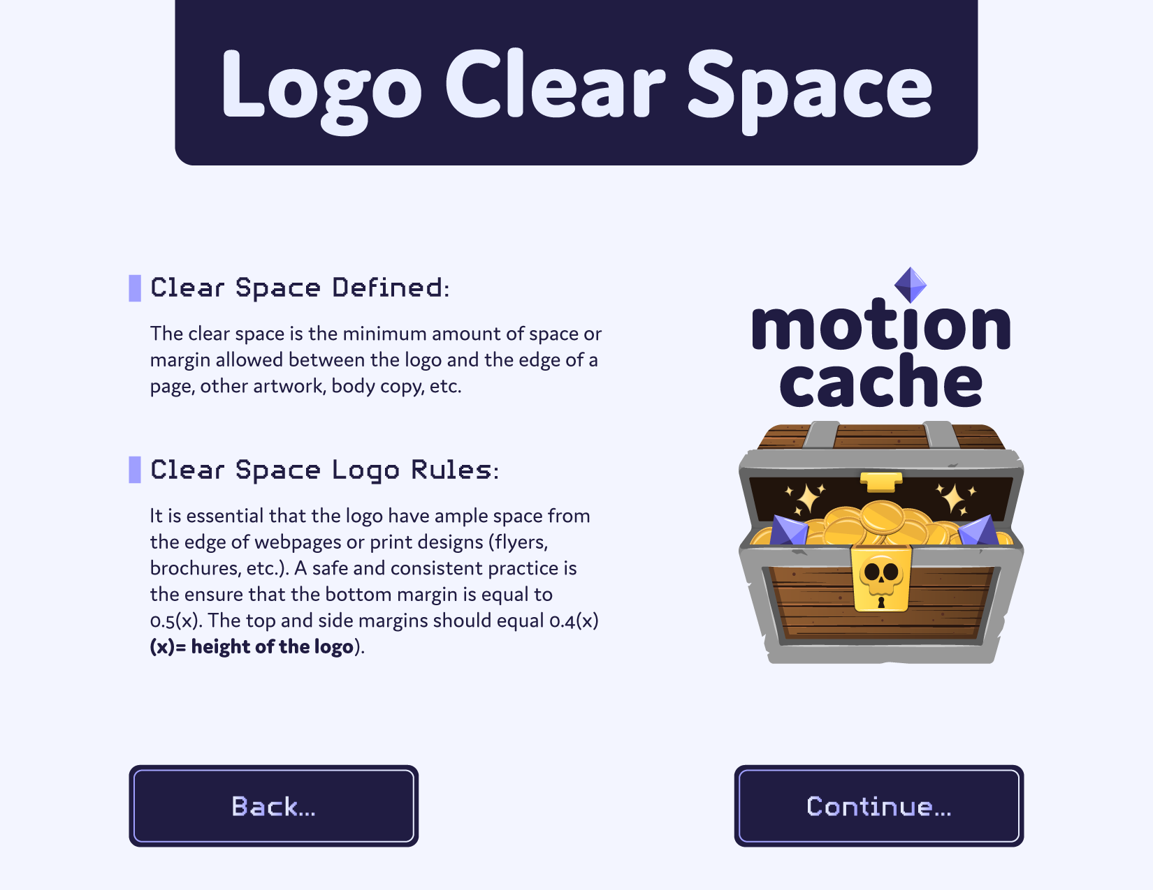
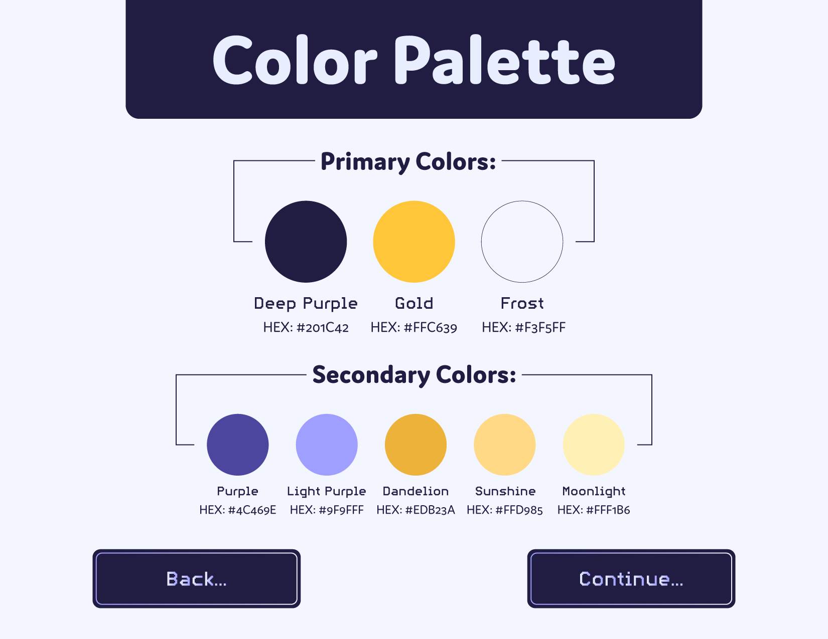
The brand guidelines emphasize motion and interactivity, not just static visuals. They guide playful, cohesive applications while allowing the brand to evolve with the client’s content. The result is a system that’s modern, approachable, and strategically aligned with the brand.


